I’ve always loved a well constructed ampersand (although I always struggled with writing my own). When I’m test-driving a font one of the first things I do is to see how the ampersands look and it’s often a deal breaker before I hand over the cash of a font license.
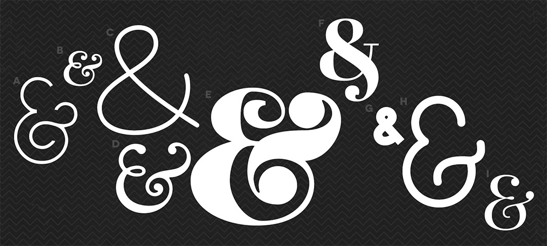
Some of the very best ones though are available for free…

A Geoma | B Niconne | C Print Clearly | D Goudy Bookletter 1911 | E K22 Didoni Swash | F Abril Fatface | G The Bold Font | H Quicksand | I Playfair Display
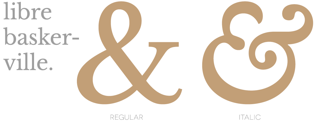
And here’s a tip – if there’s an italic version of the font, there’s often a hidden ampersand gem to be found. Just look at Libre Baskerville – its regular ampersand is a perfectly serviceable, beautifully legible character – but just look at the curvaceous beauty that is Libre Baskerville Italic…

If you too are a lover of the ampersand I’ve collected lots more on Pinterest. Do you have any favourites? Or have I gone too far into font nerd-dom?


No Comments